Color Psychology: Leveraging Colors in Marketing
Our exterior world is a vast map of colors. We wake to blue skies and green trees. Some of us sip dark brown coffee as we stare at white screens. You probably don’t drink your morning coffee and wonder, how does this color make me feel? But, when you are soaking in serenity under a periwinkle sky, it’s difficult not to think of the effects of the calming hue. Leveraging such colors in marketing could be what gives your brand the edge.
Color psychology is not an exact science, but existing findings and theories suggest that color impacts us in more ways than we know, from influencing our eating patterns to changing our mood.
The world's favorite color
In a 2015 study on color, it was revealed that blue was favored among the populations of ten countries. This is no great surprise, given blue is associated with the sky and water, both generally regarded as pleasant.
Blue is soothing. It activates the part of the hypothalamus that controls the parasympathetic nervous system, which causes decreased blood flow and heart rate.

In relaxing the body, the mind is cleared. This is one reason why blue is known for boosting productivity, a good argument for incorporating blue into office and classroom designs.
Those studying color psychology also say it projects a sense of stability and security. What's better for business than that? By leveraging colors in marketing, you can control a customer's response to a certain extent. Like how with blue you could put customers at ease.
This could clue us in on why so many logos include elements of blue. Think of all the blue-hued businesses that handle money: American Express, Visa, Bank of America, PayPal, etc. It is essential they have a client's trust. Blue primes one's trust, the partnership enforcing it.
Additionally, blue is widely discussed as being an appetite suppressant. If you're eating off a blue plate as opposed to a white plate, it's likely you'll consume less of your meal. Some think it's because blue is an unnatural color in nature, linked to poisonous berries in the wild, save for blueberries and the occasional plum. A subconscious, primal act of self-preservation.
Lastly, blue is associated with sadness and gloom. Everyone understands what someone means when they say they're feeling blue. The color has become interchangeable with the emotion.
More brands that use blue: Twitter, Disney, Skype, Lowe's, Pfizer, Dell, Ford, and yours truly, STORYSOFT.
Leverage the energizing color
Orange and energy go hand in hand.
Unlike relaxing blue, energizing orange activates the sympathetic nervous system, stimulating the body.
A great example of a company utilizing this visual stimulant is Orange Theory Fitness. As an avid OTF fan and member, I've heard coaches bookend sentences with "under the orange lights" more times than I can count. These aren't figurative lights. When you walk into the workout space at Orange Theory, you are quite literally bathed in an orange glow.

Does my energy level soar at Orange Theory because of the lighting? It's hard to say, but it could be one factor enhancing my performance.
This could have something to do with why so many sports teams' colors include orange, a sign of energy and strength, but that's conjecture. However, if we welcome the color black to centerstage for a moment, we'll see that there is reason to believe in such theories.
Study by Frank and Gilovich
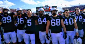
Black can be associated with death and evil, an intimidating combination. In a color psychology study done by Frank and Gilovich in 1988, they analyzed the penalty records of the National Football League and the National Hockey League to test whether professional football and hockey teams donning black uniforms would play more aggressively.
They found that they did, ranking higher in penalties than the teams not wearing black jerseys.
Frank and Gilovich noted that the referees may have penalized players more because of the perceived aggression of the color black.

Back to orange. Aside from being an energetic color, orange promotes feelings of cheer and playfulness. Think of Nickelodeon's branding. As a network for children, friendly branding is essential, making warm, vibrant orange the perfect choice.
Nickelodeon Junior adds a splash of blue to its logo. Curioser and curioser. Was it a concerted effort to blend the merits of blue and orange? Or was it a random decision based solely on aesthetics? We'll never know.
More brands that use orange: Reese's, Dunkin Donuts, Etsy, SoundCloud, Amazon, and Gulf.
The lucky and unlucky color
When leveraging colors in marketing, keep in mind that some colors elicit opposing emotions in people. Green is an exceptionally two-faced color. It has deep roots in good and evil. Our perception of it shifts drastically depending on the context, which, yes, can be said of any color, but it seems especially prevalent with green. It's the ideal subject for color psychology studies.
The good of green
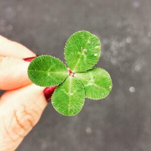
Good is a good place to start. Green is regarded as luck-bringing in some cultures. It's associated with Irish folk (think of wishing upon a four-leaf clover and the luck of the Irish). Though green first held more political and religious undertones in Ireland.

In China, green is a lucky color signifying wealth, fertility, and health. This gives it an optimistic quality. Green is for go, recycle, thumbs up, check marks, etc. It elicits positive responses.
Green, like blue, is calming, assuaging stress, which some attribute to its presence in nature. Who can resist the relaxing pull of green grass and leaves lilting in the breeze? It settles the mind and body.
From a marketing standpoint, green branding is common with health-conscious brands and stores, such as Sweetgreen and Whole Foods. It sounds silly, but I immediately trust a health food brand more if it has earthy tones and a simple design. Same goes for eco-friendly brands.
Green is also thought to ease pain. When the Blackfriars Bridge in London was painted green, suicidal jumps from the bridge dropped by 34%.
Evil green
Onto the wicked side of green. The idiom "green with envy" paints a different, more pernicious shade of green. Green means greed, toxic waste, sickness, and mucus, among other horrid things.
In James Joyce's Ulysses, absinthe is called "the green-eyed monster." That's not a pretty picture.

Green is a veritable villain color. Loki, the Riddler, and the Green Goblin wear green. The Green Arrow's vigilante get-up is green, though I wouldn't call him a villain, more so a semi-hero with questionable morals. Maleficent, Scar, Ursula, and the Shadow Man appear in clouds of green. There isn't a more villainous shade, though purple is a close second.
More brands that use green: Spotify, Animal Planet, Starbucks, Heineken, Monster Energy, and Holiday Inn.
That's just a handful of the colors working their magic on our brains.
Next time you're out shopping or browsing your favorite websites, pay attention to the brand colors presented. Do they seem tied to the application of each brand? The values? The target audience? Do you notice them influencing your purchasing behavior?
Click here for part two on how to begin leveraging colors in marketing.
Create colorful, Instagram-style digital stories for your brand with STORYSOFT. Learn more.
Book a Demo
See how to bring personalized digital experiences to life for your brand
During the call you will:
- Hear how it works
- See example digital Stories
- Walk through the analytics
- Get your questions answered